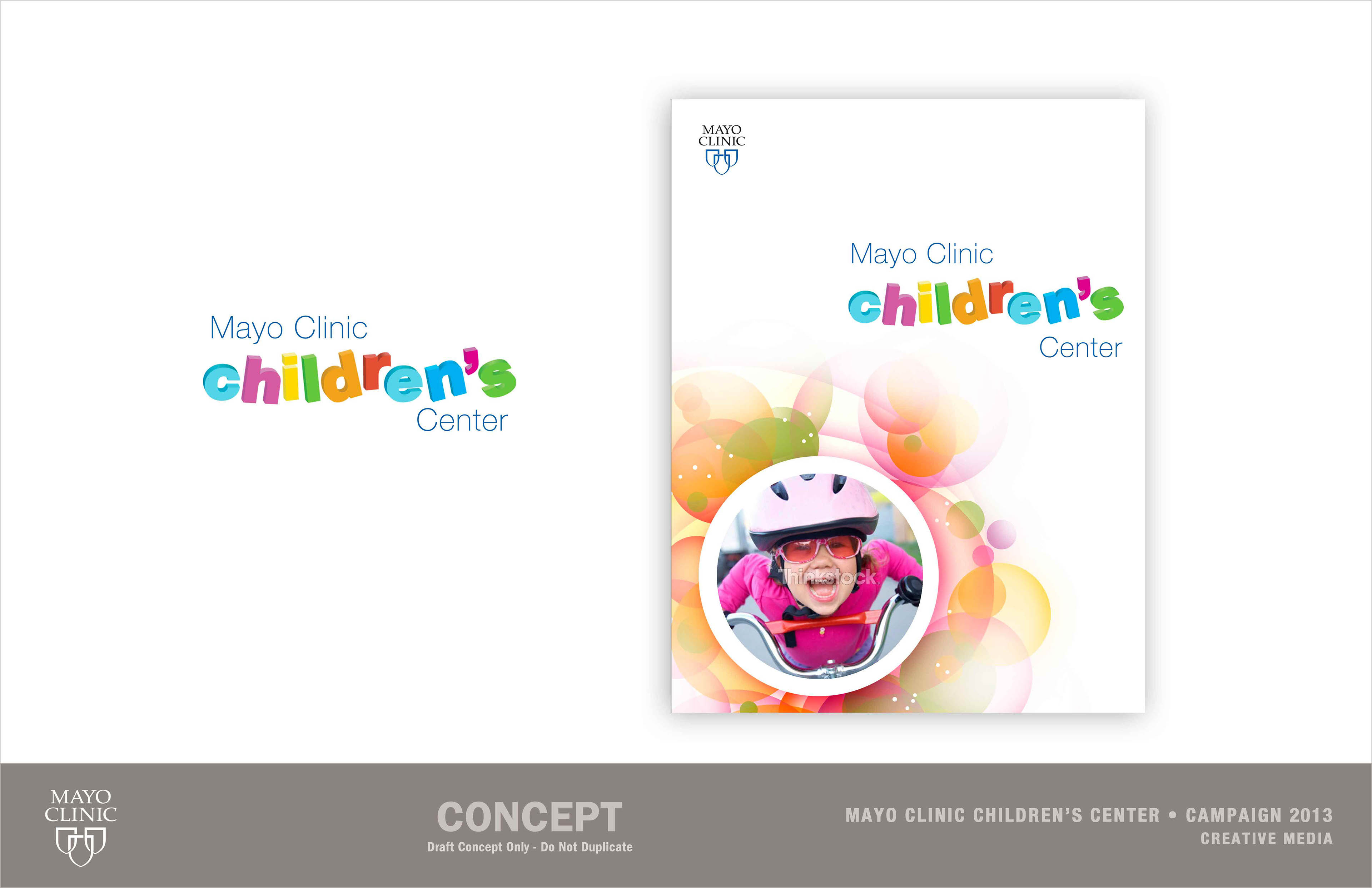
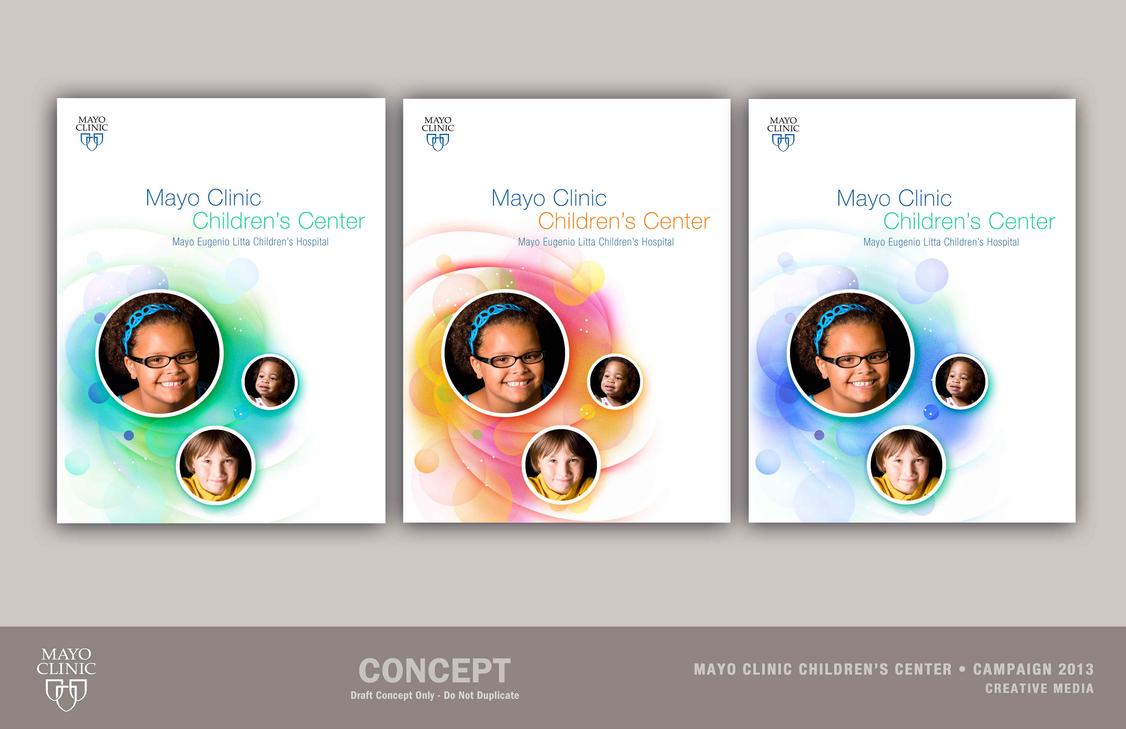
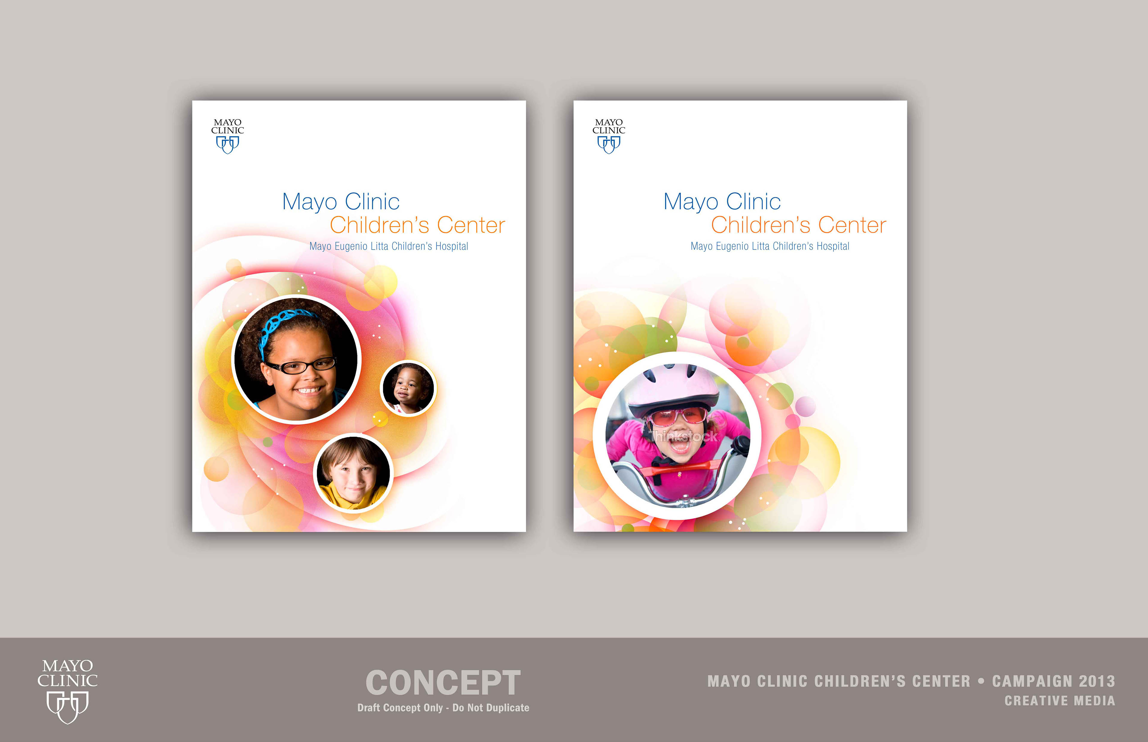
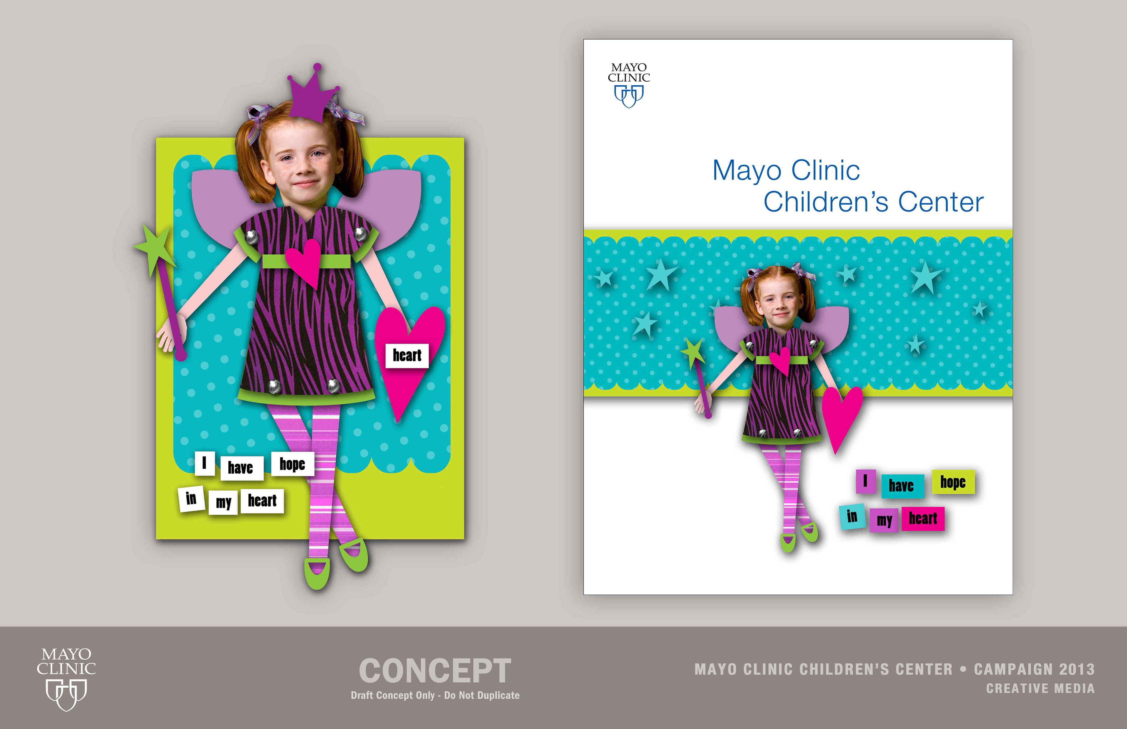
Mayo Clinic Children's Center Concepts
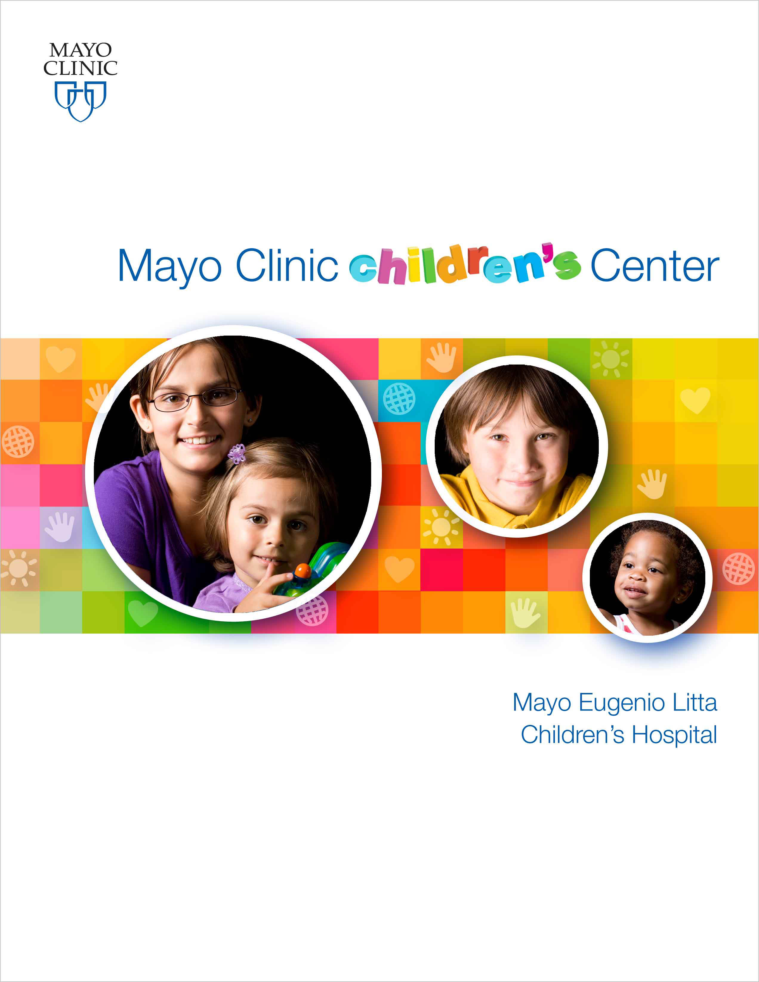
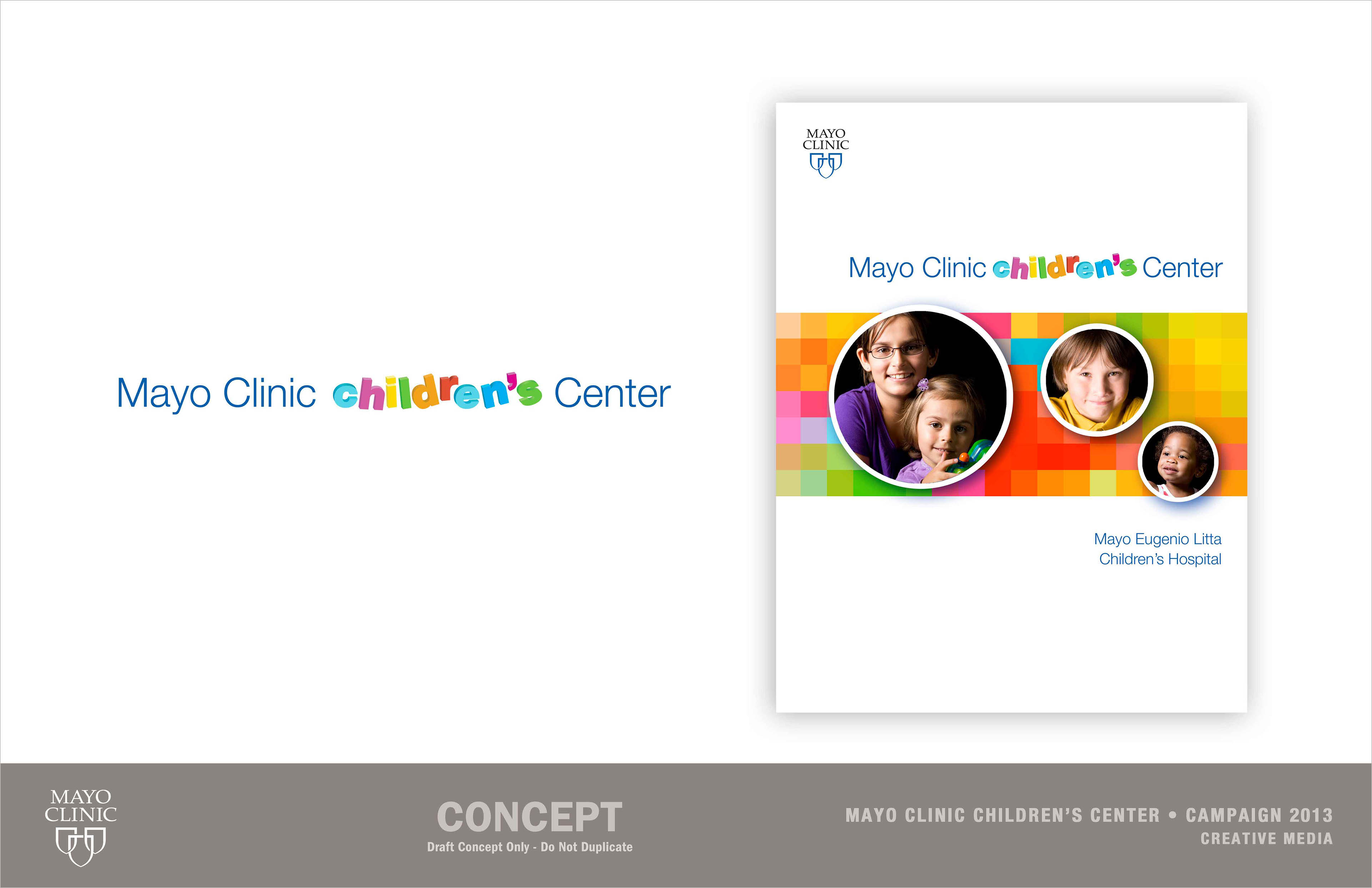
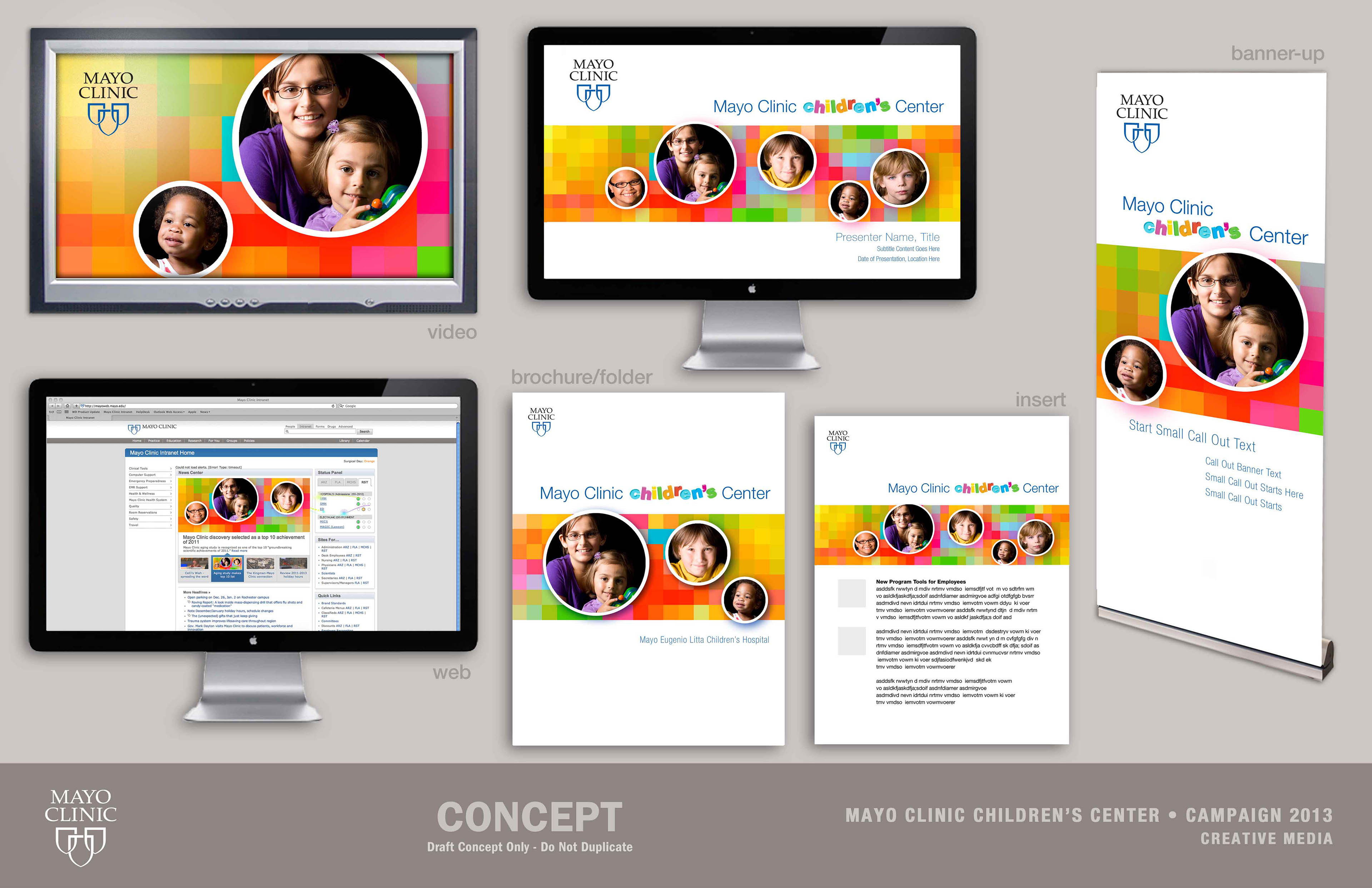
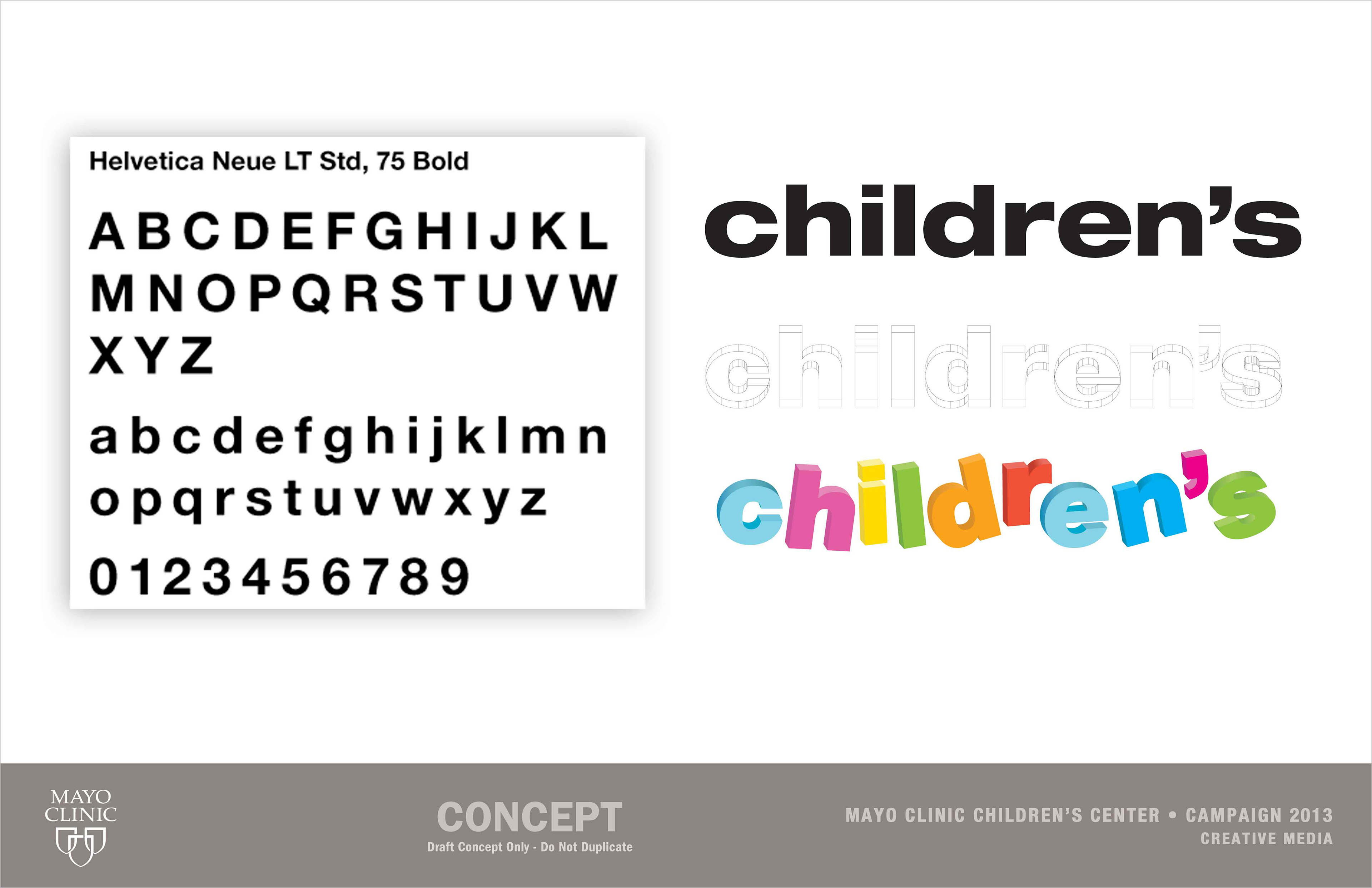
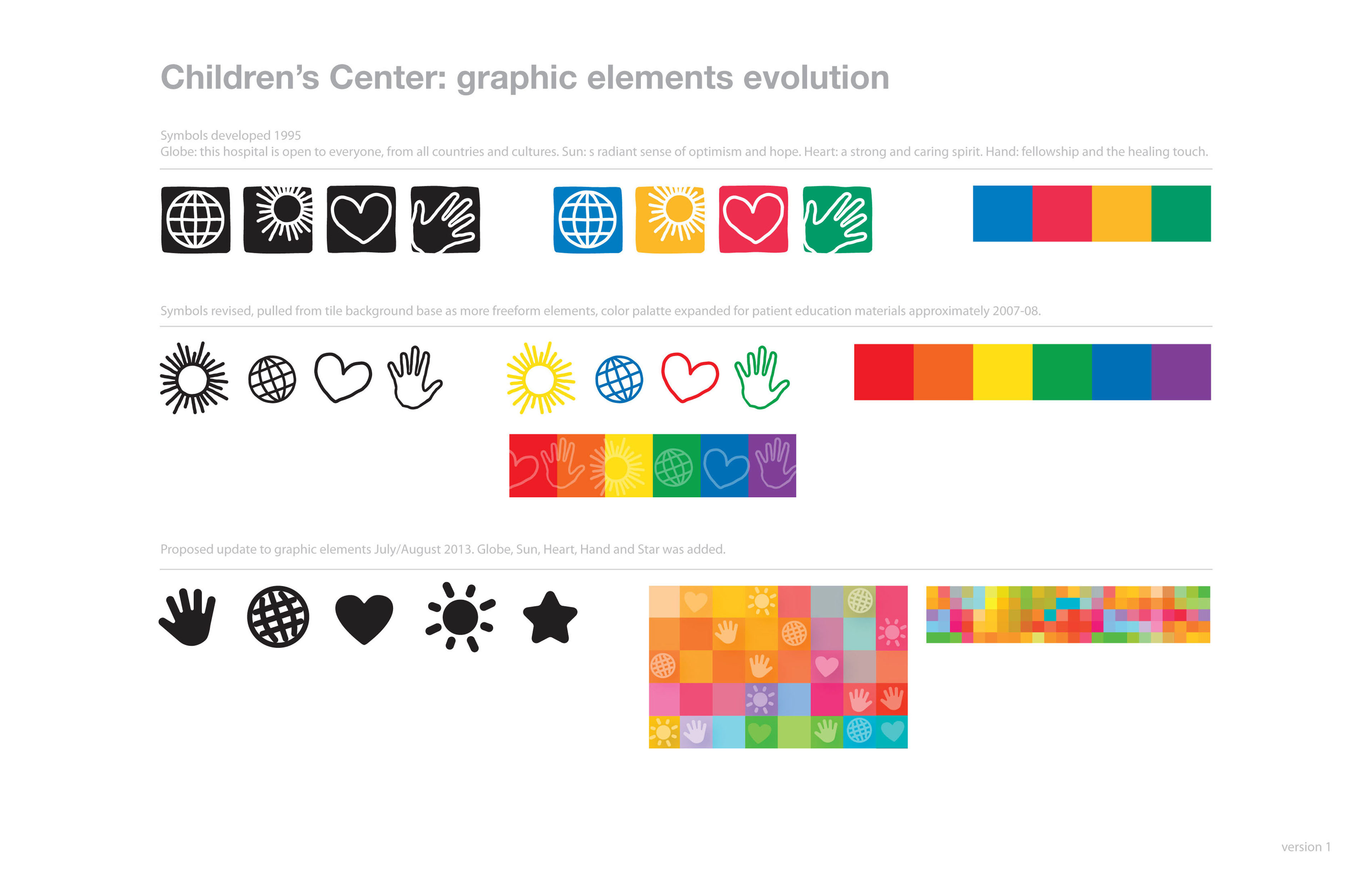
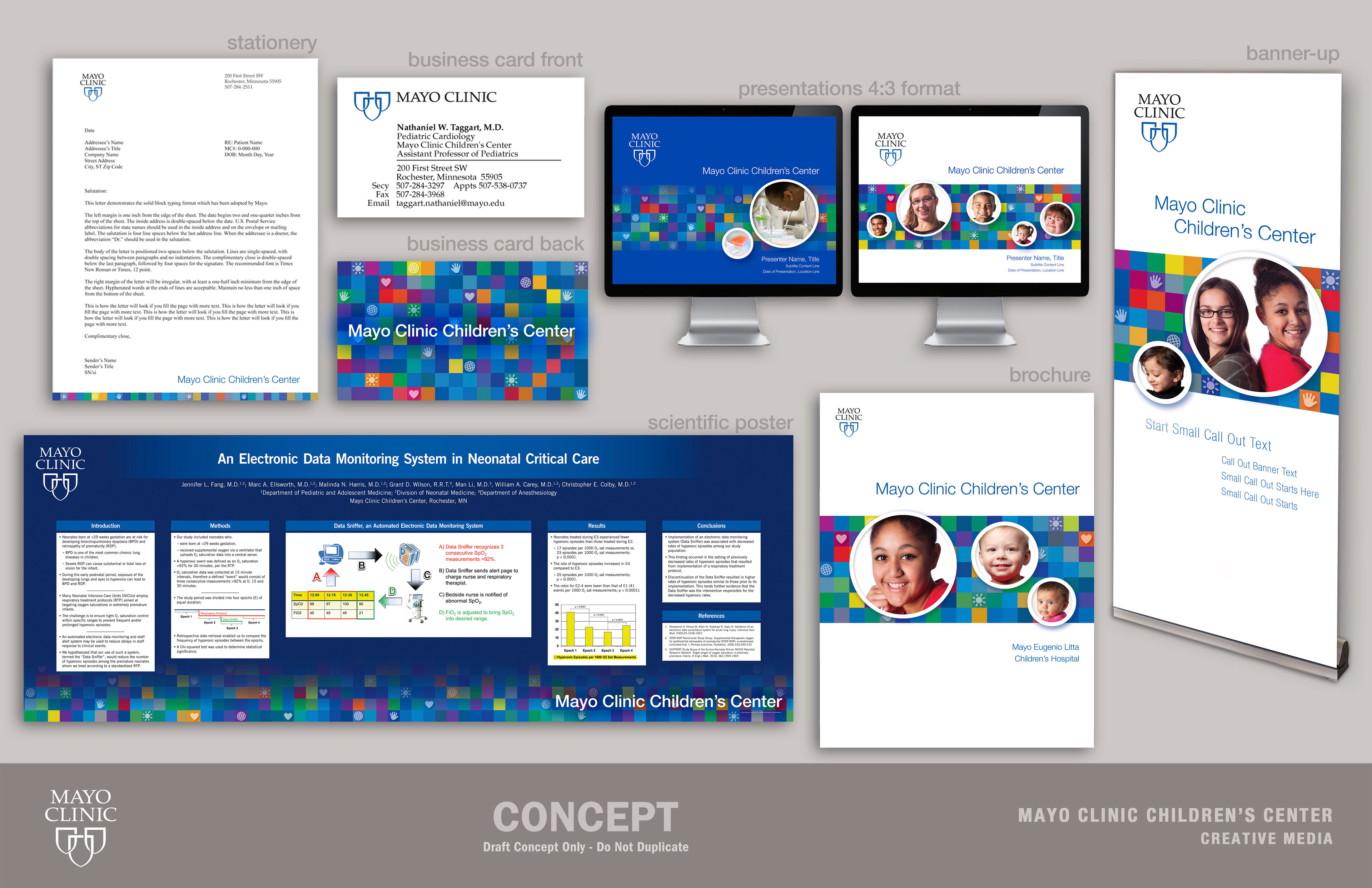
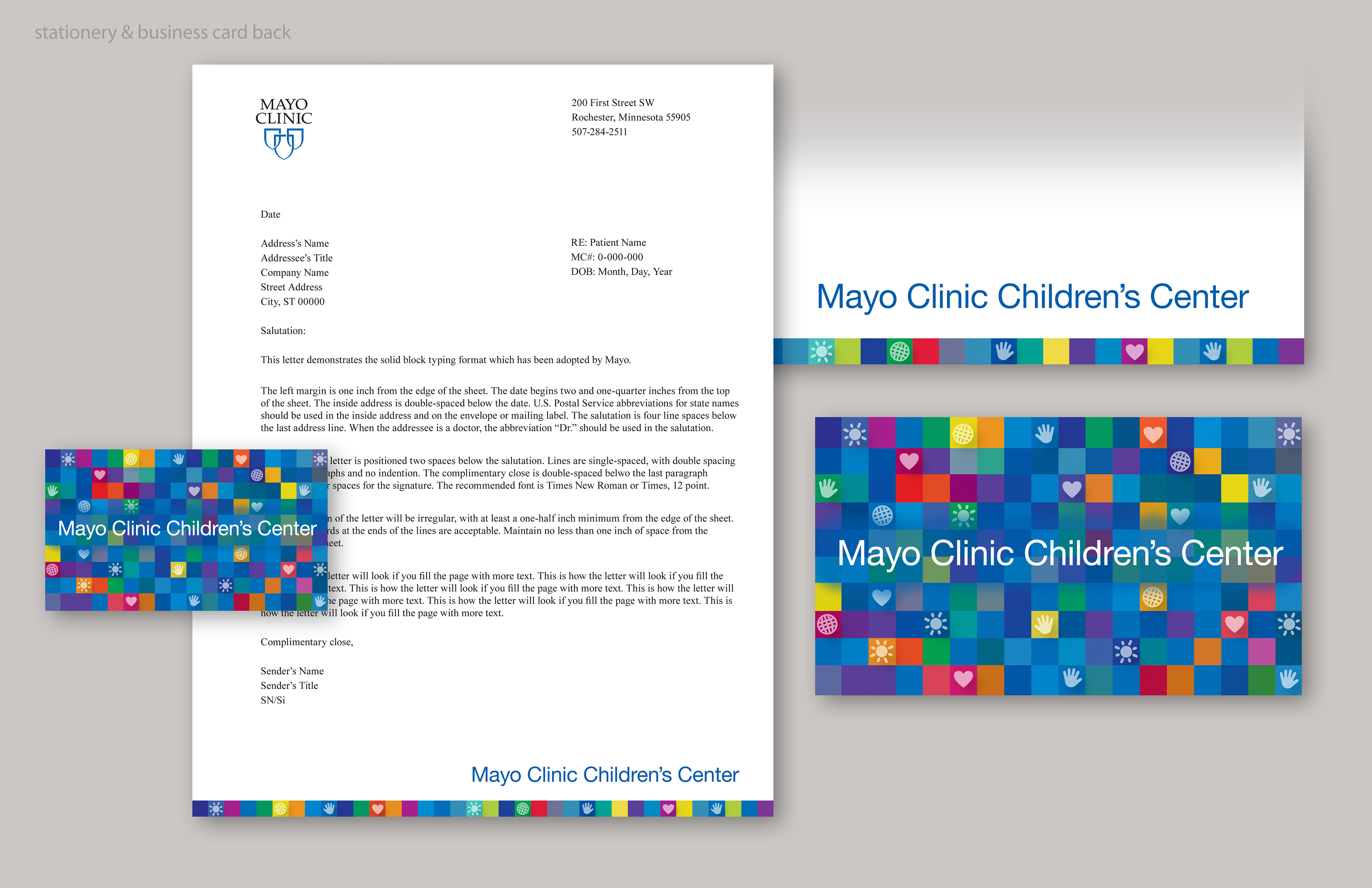
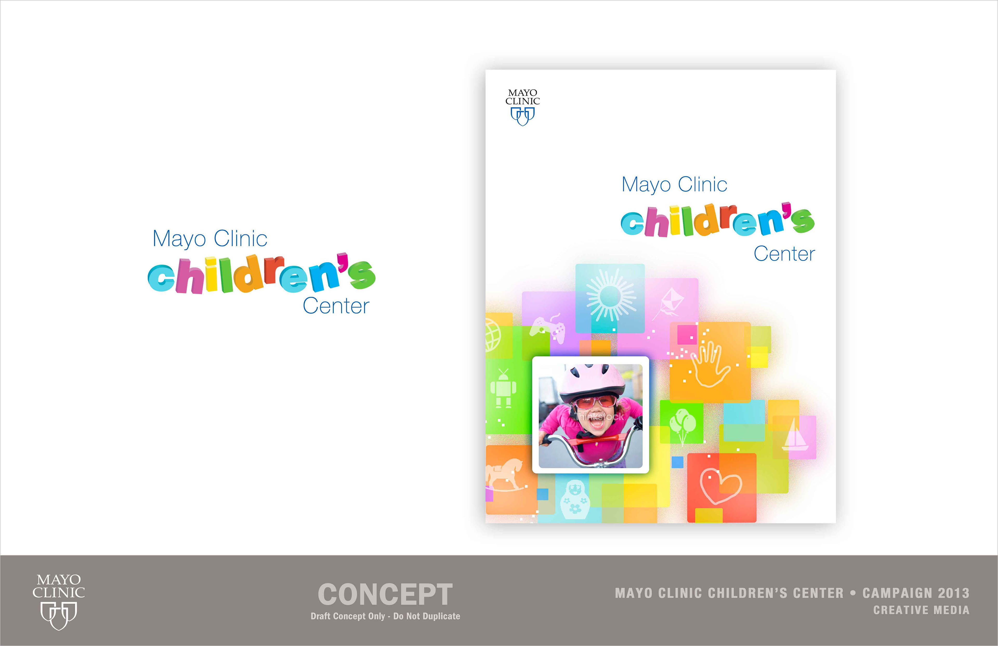
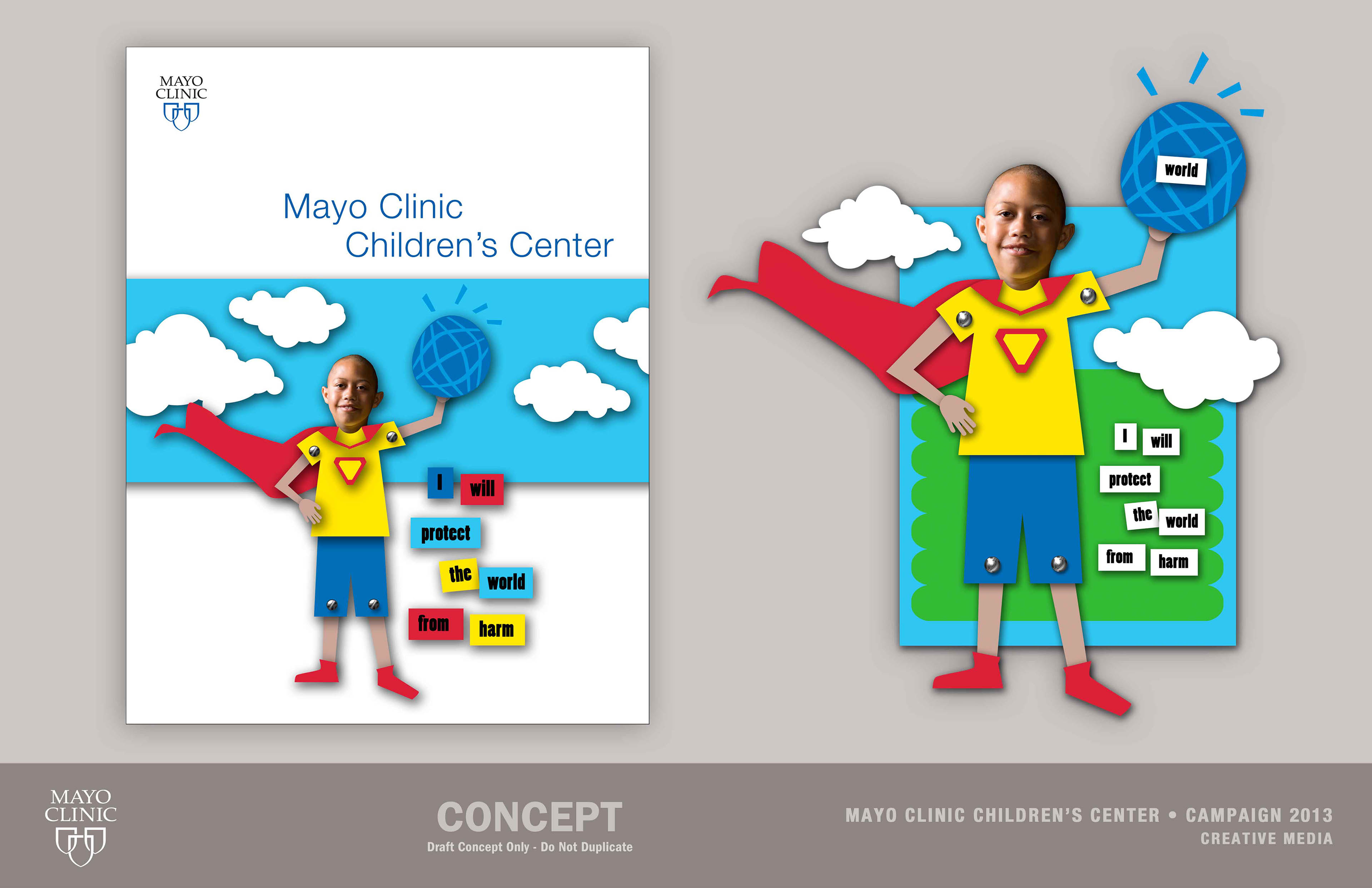
The Mayo Clinic Children's Center requested a new 'look and feel'. The campaign will be developed to create greater awareness and cohesiveness to Pediatrics at Mayo. An update occurred to the foundational tiles or graphic icons —heart, hand, sun and globe. The new look and feel and elements are fun, friendly, focused for a broad audience from scientific/academic to patient. The campaign must connect and work cohesively across a wide range of media applications such as presentations, folders, bannerup, stationary, business cards, photography, insert sheets, animation, video and eScreen, advertisements, digital banners, print brochures, direct mail postcards, print and electronic magazine and newsletter, web and social media.